Last Updated: January 17, 2019
These days, we don’t just expect websites to look good and provide helpful information – we also expect them to respond to the size of the screens on which we view them. Whether we’re using a mammoth desktop, a standard laptop, a versatile tablet, or a basic smartphone, we want websites to accommodate our preferences. And we aren’t the only ones – Google also favors flexible websites that adjust to the size of viewers’ screens. You may have heard this technique referred to as responsive web design. But what is responsive web design exactly? How does it differ from a mobile website design? And what guidelines do you need to follow if you’re creating a responsive website?
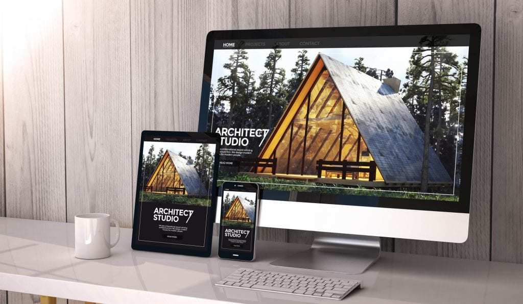
What Is Responsive Web Design?
Creating a responsive website in 2020 isn’t a choice; it’s imperative.
What is responsive web design? It is a form of web design in which the designer approaches the project with an eye toward providing users with the best possible viewing experience regardless of the device they use. A responsive website is capable of adjusting its elements to adapt to the screen size on which it is being viewed. This ensures that the viewer is always seeing an optimized version of the website, eliminating the need to squint at tiny text or scroll repeatedly to find specific information on the webpage. The outcome? A happier audience, a versatile website equipped for evolving screen sizes, and improved SEO.
For example, check out how one of our recent blog posts stretches and shrinks to fit the size of the browser window:


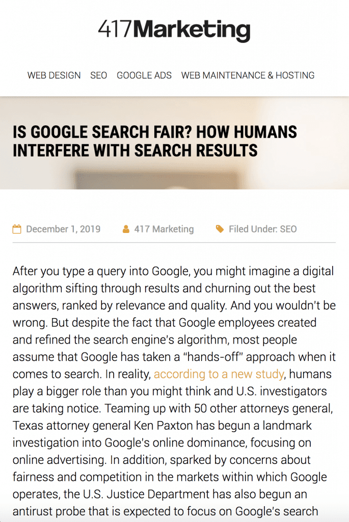
Imagine if the paragraph widths didn’t resize to accommodate the browser screen size. The reader would need to scroll left and right, back and forth, from line to line in order to read the article properly. That’s a lot of work! A responsive website creates a more pleasant reading experience, where the reader is only required to scroll upward and downward.
Responsive Web Design vs. Mobile Websites

Responsive web design is a flexible, adaptable solution that goes beyond simply accommodating the small screens of mobile web viewers. In fact, there are many differences between a responsive website and a mobile website.
For starters, a responsive design only requires one website, whereas a mobile website requires several versions. To clarify, a mobile website is an additional version of a webpage that has been optimized for small screens. If you’re creating a mobile strategy in modern times, you’ll need at least four different versions of your website to cater to the four general screen sizes: desktop monitor, laptop screen, tablet screen, and mobile phone. Why would you want to build so many different versions of your website when there’s a convenient, versatile alternative?
Another significant point of distinction: If you create a mobile website instead of a responsive one, you’re clinging to the old-fashioned idea of a fixed width or screen size. Get with the times! This is precisely the sort of thinking that responsive web design seeks to move away from. Responsive websites focus on flexibility. Technology is always adapting, and no one knows what devices and screen sizes will be available in the future. By embracing a responsive design, instead of a static design, you’ll be better prepared to digitally evolve.
The Case for Responsive Web Design
As of 2019, over half of global website traffic comes from mobile devices, so it is absolutely essential for your website to look great on all types and sizes of mobile devices. After all, web browsers have countless options online. If your website doesn’t offer an excellent user experience, visitors are bound to find competitors of yours that do. At this point, it’s frankly a little late to be asking, “What is responsive web design?” User expectations have increased dramatically over the past two decades. Users demand full functionality when they access a webpage from their mobile device, and they expect consistency from one device to the next.
Moreover, with the ever-changing digital landscape, who’s to say that a differently sized mobile device won’t dominate the market in, say, ten years or less? When that happens, do you plan to craft another version of your website? And what about the next device, with its unique measurements? And the next? And the next? You get the idea. You could create several iterations of your website, but what if the necessary number of versions continues to increase? And don’t forget – when it comes time to update your website, if you have several versions, you’ll need to spend time updating and editing each individual version. Think about all the time and resources that would waste. How long will you continue with this madness?!
What Is Responsive Web Design Comprised Of?
According to Ethan Marcotte, the so-called pioneer of responsive web design, there are three main ingredients needed to craft a responsive website: media queries, fluid grids, and flexible images.
Media Queries
A media query is a CSS technique introduced in CSS3 that is used to determine the context in which a website is being accessed. It can, for example, find out the resolution of the device being used or the bits per color component. Based on this knowledge, the web content will then be rendered according to the conditions set forth in the code. It does this by using the @media rule to include a block of CSS properties only if a certain condition is true. For example, if the browser screen is 600px or smaller, you can specify that the background color will be white.
Fluid Grids
A fluid grid is a basic grid structure that isn’t based on pixels (which are static), but on ems (which are flexible). Because the dimensions are stated in terms of percentages or proportions, the grid will adjust to the viewer’s screen size. In addition, a flexible grid ensures that other components of the design (such as padding, margins, and type) will adapt to the screen size as well. For example, check out how this website is viewed across three different screen sizes:
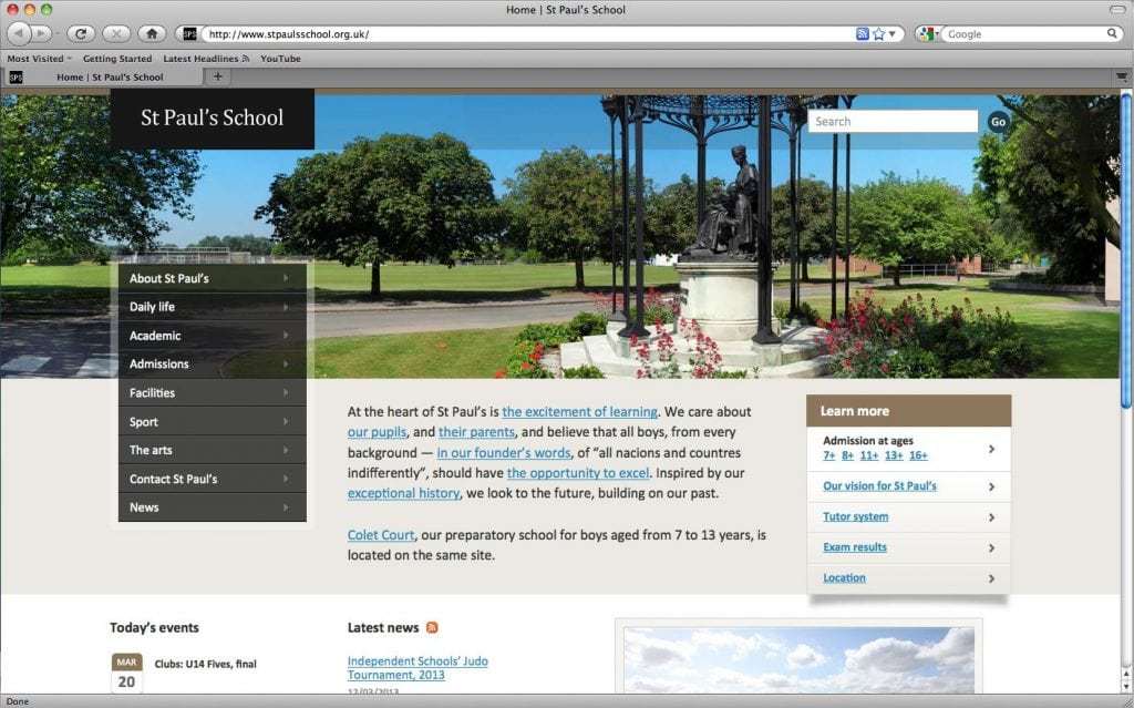
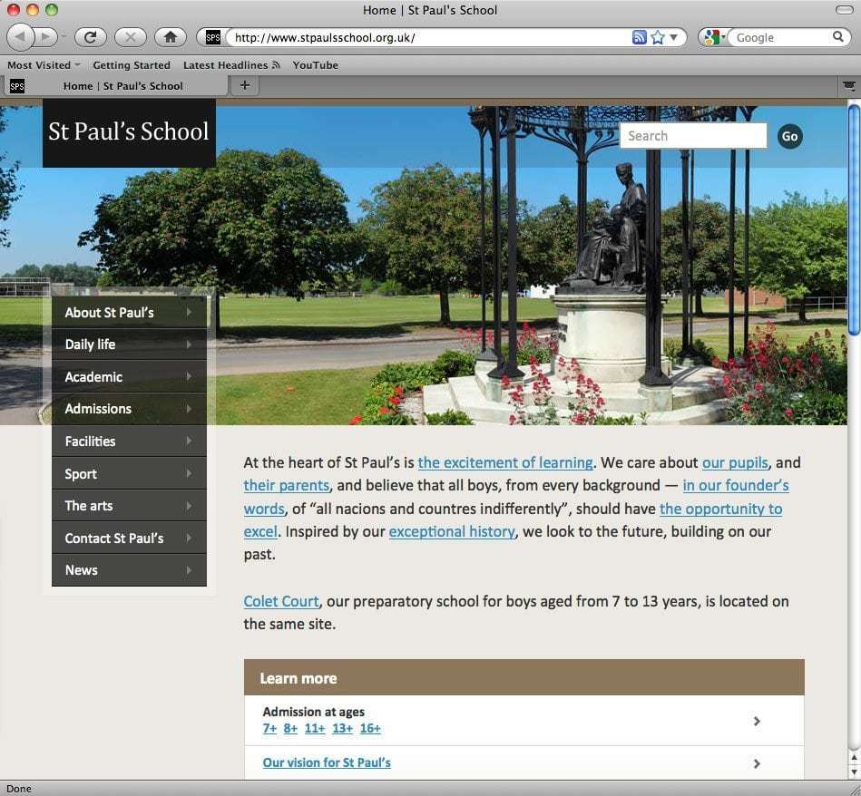
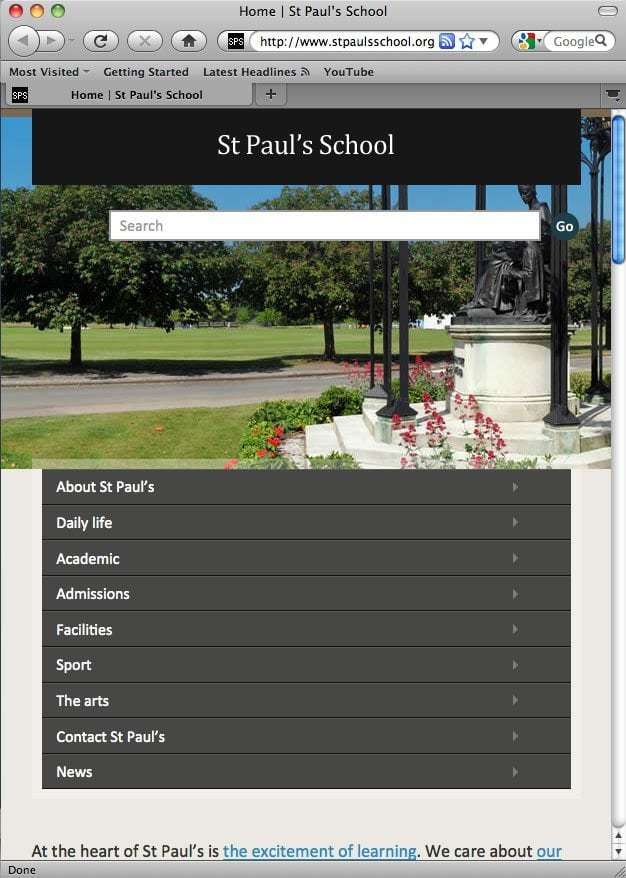
Focus on the picture for a moment. Do you see how it remains static from screen size to screen size? This isn’t a big deal, since the photo mostly serves as a background image. However, in most cases, a responsive website will need to have flexible images . . .
Flexible Images
Flexible images are images that scale in size depending on the the size of the browser screen. Because they minimize scrolling by eliminating oversized images that stretch beyond the screen space, they’re a key part of most responsive web designs. Take, for example, the Food Sense website (displayed below). The image sizes change from screen to screen, as do other responsive elements, like the grid, the navigation, and the text. The elements of the page always look attractive and make sense logistically, no matter what the screen size.


Responsive Web Design Tips
As you craft a responsive website, don’t forget the meaning of the word “responsive.” The internet is a continually changing medium, and a responsive approach will help you roll with the punches. It throws aside the old-fashioned notion of fixed dimensions – an idea that worked well in traditional print media but doesn’t suit the dynamic nature of the internet. These days, nearly all popular websites have adopted a responsive approach to web design.
If you want to design a successful responsive website, you need to embrace a responsive mindset and then complement it with valuable tips gleaned from successful mobile strategies.
- Look beyond layout. Keep in mind that the reason why you are taking a responsive approach in the first place is to provide users with an optimal viewing experience, so think about what sorts of tweaks will benefit them. For example, adjust the target area of your website’s links – clicking on the right link may seem like a piece of cake when using a mouse, but it’s far more difficult when you’re on a touchscreen device and using your thumb to navigate.
- Use breakpoints to create a flexible layout. One of the main differences between the dynamic nature of a responsive website and the static nature of a mobile website is that the latter designs to particular dimensions. With your responsive website, use breakpoints to determine the screen sizes at which certain elements of the webpage should adjust. According to UX Tricks, there are currently six common breakpoints, as of 2019.
- Ensure full functionality and consistency across all media. Mobile designs often minimized content in the past, but that’s no longer the case. As a result, it is important to keep in mind the context in which a user may be accessing your website and design accordingly. Instead of removing content, rearrange it.
- Establish the bare essentials and then work your way up. Set the lowest common denominator for the smallest screen size deemed reasonable, and then add elements and rearrange content as you scale up. This idea, known as “Mobile First,” was developed by Luke Wroblewski in 2009. Since mobile websites have more usability concerns, it’s often practical and efficient to start with mobile and then build up to a desktop version. Keep in mind that your design shouldn’t be “Mobile Only” – people are still viewing your website on both desktop and mobile devices, and it’s important that they all have positive experiences.
_____
So what is responsive web design? A responsive website renders well across all devices and adapts to its users, not the other way around.
These days, responsive web design is mandatory. Your website should look sensational on desktops, laptop, tablets, smartphones, and whatever new devices are introduced in the years to come. It should also be easy for viewers to navigate your website and find key information, no matter what the screen size. In the years to come, web design may need to account for foldable and stretchable screens, more notches on devices, dual displays, touch screens for desktops and laptops, and more. By ensuring that your website is responsive, you’re making it more likely that your website will look good now and in the future.
If you’re hoping to build a beautiful, effective website that ranks highly on Google, contact 417 Marketing for help. Our team of knowledgeable, creative, and passionate professionals specializes in SEO, web design and maintenance, and Google Ads, and we have successfully completed over 700 websites since our inception in 2010. Click here to contact us and learn more about what we can do for your company.


