If you’re new to the world of web design, you might be looking at the logo above and asking yourself, “What is the 960 Grid System?” Simply put, it’s a design strategy that is based on a grid. Sounds good so far, right? Let’s dig a little deeper . . .
What is the 960 Grid System?
The 960 Grid System was created by Nathan Smith as a tool for his own web design. He based it on the number 960 because, when divided, 960 creates a lot of clean, whole numbers. It simplifies the math involved so that you’re not wasting time on complicated numbers (I’ve always hated 33.333. . . ).

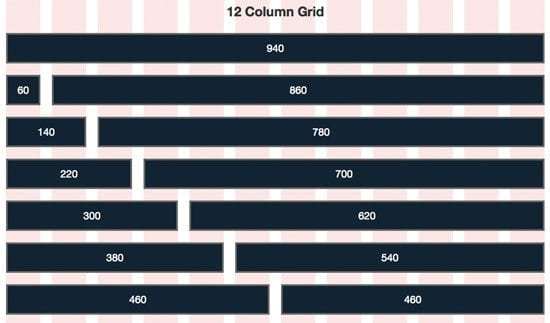
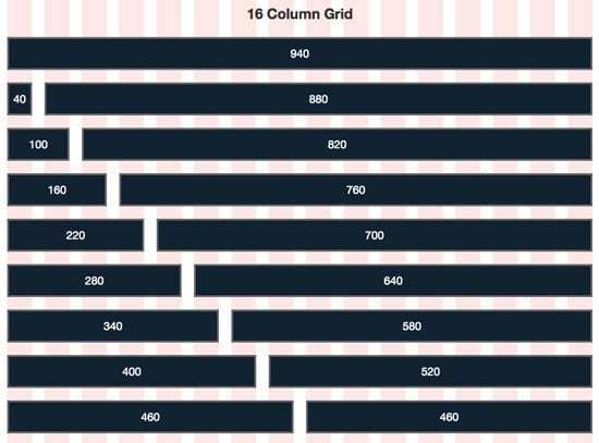
So let’s set up your grid. The basic idea is that your page is always 960 pixels wide. You can divide the width into 12 columns (at 60 pixels each) or 16 columns (at 40 pixels each). There’s also a 24-column version (if you want to get really crazy with it).
Each of these columns has a 10 pixel margin on both its left and right side, creating 20 pixel wide gutters between each column. Using this grid and its figures, you can move the elements of your webpage easily and systematically, keeping everything organized and aligned.


So what is the 960 Grid System? Most basically, it’s a grid system used to keep your web design organized.
But the more important question is—should you use the 960 Grid System? Or better yet, why should you use the 960 Grid System?
Why should you use the 960 Grid System?
The 960 grid system stems from one of the most basic principles of good design: alignment. When our eyes view and digest the world around us, they’re constantly searching for patterns and organization. When objects are aligned, we understand them and process the information more quickly. Sometimes, that’s not a good thing (an artist, for example, might want you to spend time figuring out their confusing, haphazard masterpiece). But when it comes to good web design, speed and cleanliness is a benefit.
With modern technology, we have the world (and a billion other websites) at our fingertips. If information isn’t presented clearly and in a way that makes sense, many viewers will grow impatient and search out another, similar, cleaner website. We want to understand and we want to understand quickly. A grid system helps designers achieve that sense of visual alignment.
Creator Nathan Smith compares this goal of alignment and speed to a swimming race. Imagine what an Olympic swimming pool would look like without those buoyed lines dividing up the pool (Chaos, right? I don’t think Michael Phelps would be pleased). A grid accelerates progress while maintaining order. It’s a perfect combination.
Now that we’ve answered the question “what is the 960 grid system?”, let’s look at the benefits of it.
If you value both organization and flexibility, the 960 Grid System might be the right choice for you. To use it, simply input the columns’ widths when laying out objects. So if you want an object to span the width of several columns, you apply the proper class to your div. If you want to fill up an entire width with different objects, be sure that all the widths will add up to 960. If you want to push or pull items horizontally across the page, utilize the push_XX and pull_XX classes, which allows you to rearrange elements independent of the order in which they appear in your markup. And because of the base width 960 pixels, all of your numbers will be clean and easy to remember. With some simple math, you’ve got complete control over your grid.
So while the 960 Grid System encourages clean, efficient web design, it can also be flexible. It aims to organize your design, not restrict it. And if you like the system’s grid technique, clean numbers, and push/pull options, it might be the perfect framework for you. But before you dive in, let’s look at a few of its limitations.
What is the 960 Grid System’s downside?
Well, there are a few.
First of all, the 960 Grid System doesn’t handle typography. It also doesn’t have a set text or page background color. For some, this might be a drawback. For others, it will be convenient because you won’t have to override a lot of preset design choices.
Next, the system can be limiting, depending on your artistic choices. If you don’t like the look of standardized web design or you want your website to be more abstract, you might find the 960 Grid System stifling.
Finally, the system works best if your website is fairly complex. If your content is very simple, you might not need an organizational structure at all.
So what is the 960 Grid System?
Hopefully, by now, you can tell me! But at its essence, the 960 Grid System is a clean, organized, grid-based, free design framework that may or may not be the right choice for your web design.
And finally: should I use the 960 Grid System?
I can’t answer that question for you. It depends entirely on your own personal process, designs, and goals. However, I’d like to point out that the 960 Grid System is only one of many different grid-based design frameworks. And grid-based design programs are only one of many design frameworks. It would be worthwhile for you to check out the pros and cons of a variety of different frameworks like The Responsive Grid System and Blueprint (among many, many others). Choose the framework that works best for you. You’re bound to find one you like and if you don’t, you can always create your own!