How in-tune are you to the top web design trends for 2013? In case your answer is “not very”, we’ve compiled a list of the top web design trends for 2013 to get you all caught up. Well until 2014, that is . . .
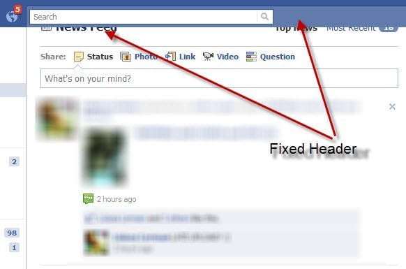
Fixed Header Bars
Fixed header bars are featured on a number of popular websites (Facebook, Twitter) and they’re becoming more and more common all the time. They’re perfect for websites in which a viewer might get carried away clicking on link after link, because no matter where that viewer wanders, the header bar is always there to offer quick navigation.
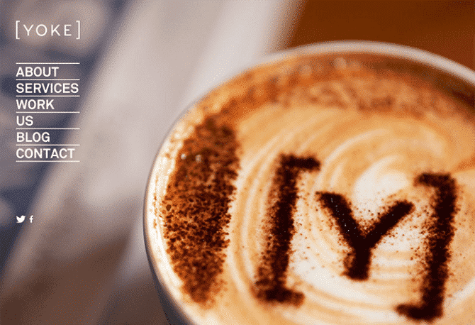
Large Photo Backgrounds
Think big! Many web designers have been using enormous, beautiful photos as background images this year. It’s a bold look that really allows you to catch your viewers’ attention, especially if you utilize your white space well and take your time with the typography.
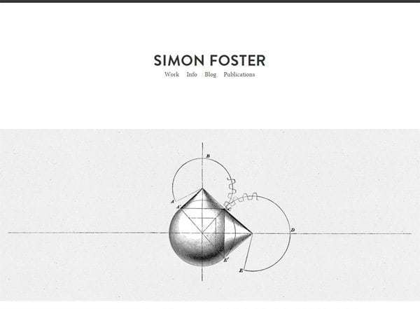
Minimalist Landing Pages
Simplicity isn’t just about clarity and elegance; it’s a chance to really emphasize whatever is you think needs emphasizing: your new product, your most popular service, your portfolio, your face, whatever! Minimalist landing pages utilize white space to direct the viewers’ attention. Plus, they make navigation a cinch.
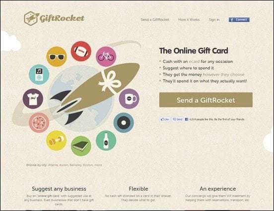
Flat Style
The style of web design in 2013 is decidedly flat, and I don’t mean that in a bad way. Expect to see more flat style and flat colors, both of which work well on adaptive products, retina displays, and 3G connections. This style of design is simple, restrained, and very user-friendly, straying away from nifty special effects like 3D textures and drop shadows. There is also much less skeuomorphism, or design that resembles real-life objects. Apple’s redesign of iOS7 is a perfect example of this trend. We here at 417 Marketing may be working on a flatter design. If we were (hypothetically speaking, of course), it would be pretty cool. We’ll see.
Parallax Scrolling
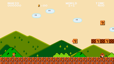
While parallax scrolling has been used in video games for decades now (hence, the Mario gif above), it is now entering the world of web design as well. The technique usually scrolls background layers slower than foreground layers to create a 3D effect, but sometimes the graphics move in other ways (though they always hinge on the user’s scrolling). Parallax scrolling works well for websites designed to tell a story because it creates an immersive, film-like atmosphere. Check out this site for a fantastic example. However, parallax scrolling isn’t for everybody. It only works on certain kinds of websites (graphics or images must play a huge part in your design) and the designer must be experienced with the technique or viewers might be left feeling dizzy and annoyed.
Infinite Scrolling
With infinite scrolling, you’ll never have to click through results pages again! Sites like Pinterest, Tumblr, and Facebook have begun using this handy, continually-loading tool to improve the user experience. It’s simple but oh so convenient.
CSS Animation
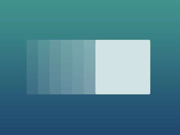
Designers can now add motion, fluidity, and special effects using CSS properties. This allows for the creation of lovely hover effects, form input fields, and effects connected to times and settings, all without using JavaScript or Flash. Because this is a relatively recent development, it will likely advance a lot in the coming months and years, but it’s already gotten a lot of great buzz.
– – – – –
The design world is always shifting—disposing of old ideas, inventing new ones, pulling crumpled ideas out of the trash and reshaping them. So while it’s fun to follow the trends, remember that the most important thing is that you love your design. That’s what really matters. Well, and that your website is easy for search engines to crawl and digest. For more on that, head here to learn about search engine optimization.


